Selected works
Savate Specimen
WebsiteSpecimen mini-site for Savate, Plomb Type's first typeface release.
The specimen features characters and boxing accessories inspired by vintage tin toys.
The website blends interactive type testers with videos and scroll animations.
Design by Max Esnée and Emma Marichal
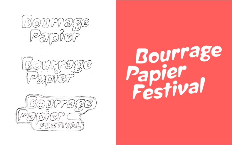
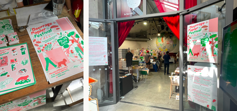
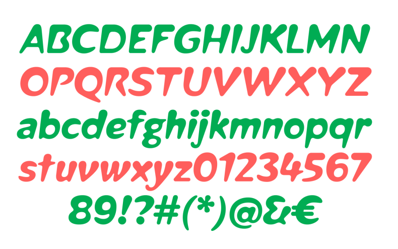
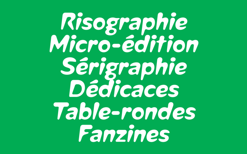
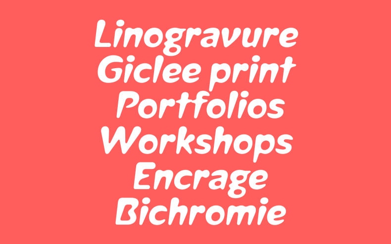
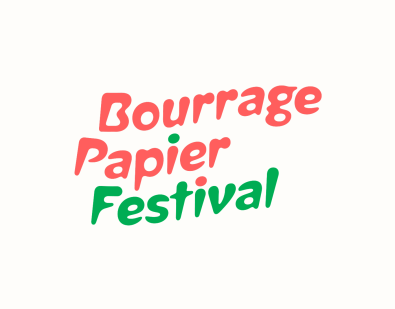
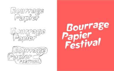
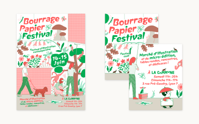
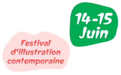
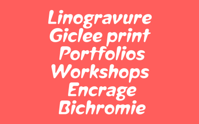
Bourrage Papier Festival
Art DirectionBourrage Papier is an independant illustration festival in Lyon, France.
Creation of the logo and of a custom typeface for the 2025 edition.
Illustration: Ella Coutance, Simon Bailly
Graphic design: Camille Gobourg


Area Specimen
DevelopmentBlaze Type is a french type foundry based in Lyon, founded in 2017 by Matthieu Salvaggio.
Development of a specimen mini-site for the Area family.
Design by Alexis Cros